
Industry
HR, Fintech
Client
Deel
Building the design system for Deel, the worlds fastest growing start-up.
The objective
Deliver a working design system with 72 components
Published and usable in both Figma and Storybook libraries
Delivery within three months
Emphasis on speed and delivery
Project overview
Reduction in build time
Increased consistency
Building the system
As the Deel Product has a heavy focus on mid-to-large sized components, I focused on this distinction, with a goal to re-use components throughout as the team would build the system.
To do this, it meant building the smaller components first, in order to use them in other builds. This diagram illustrates the model of how the system was built.


Colours (Primitive)
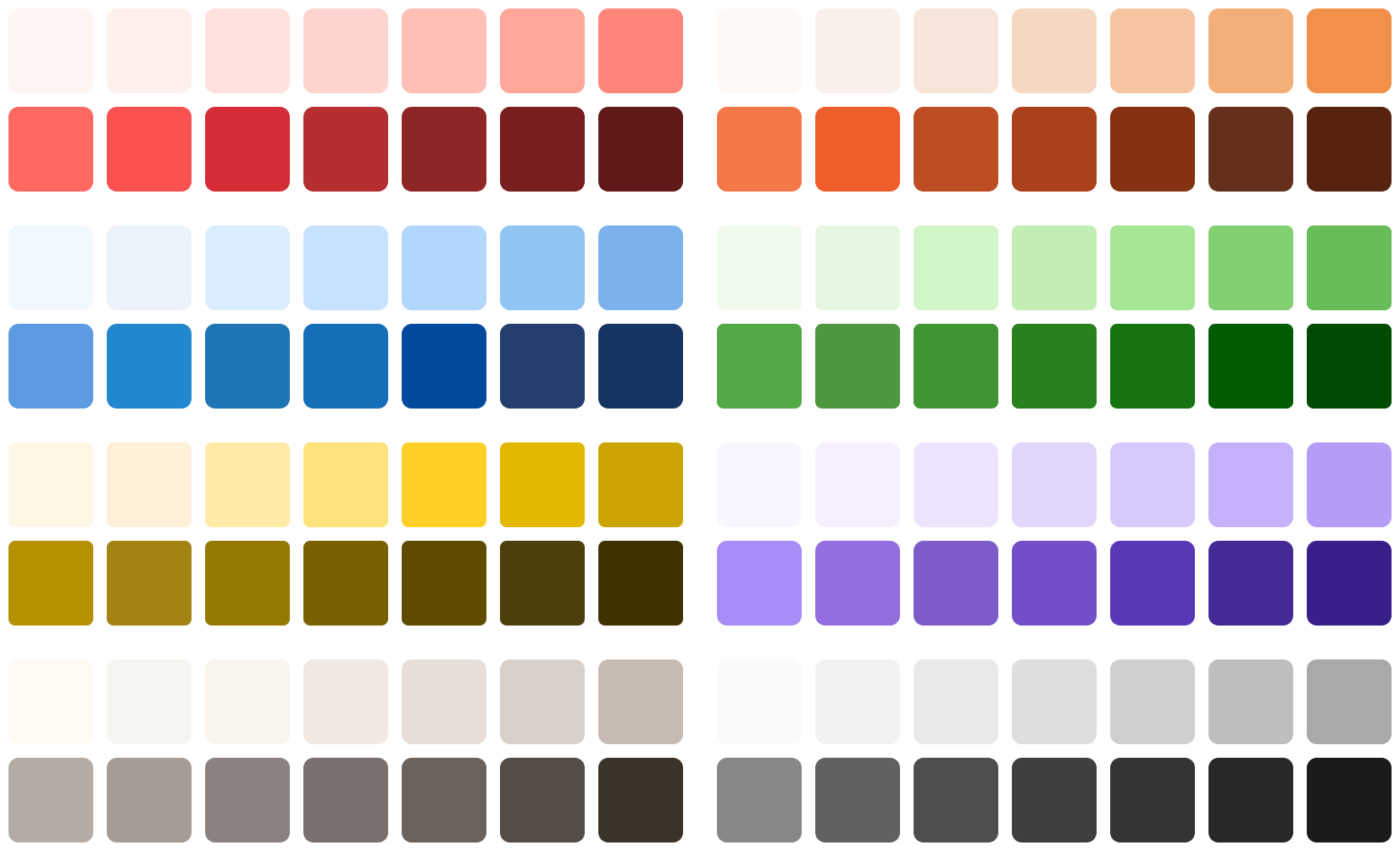
Icons

Typography
h1.medium.desktop
h2.medium.desktop
h3.medium.desktop
h4.medium.desktop
h4.semibold.desktop
body.regular
body.semibold
Spacing

The foundations are the core building blocks ('Atoms' in the Atomic model) of a system, they cannot be broken down into smaller elements.
Multiple foundations are combined to create components. Components are combined to create larger components and these are combined to create templates. These foundations ensure consistency and balance up this scale and across experiences and platforms.
It is important to stress test the Foundations with wide variety of input, as it can difficult and time consuming to change once coded.
Design Tokens
The naming of foundations in the system changed to the token name when tokens where introduced, a year after the system was built.
More on this in the Tokens Case Study (not yet live).

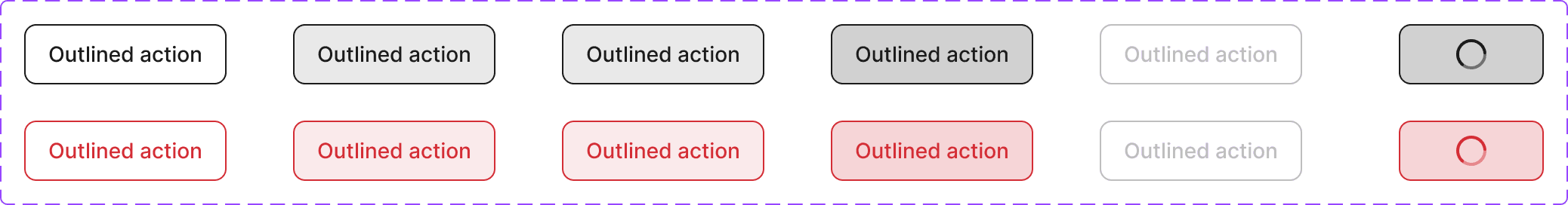
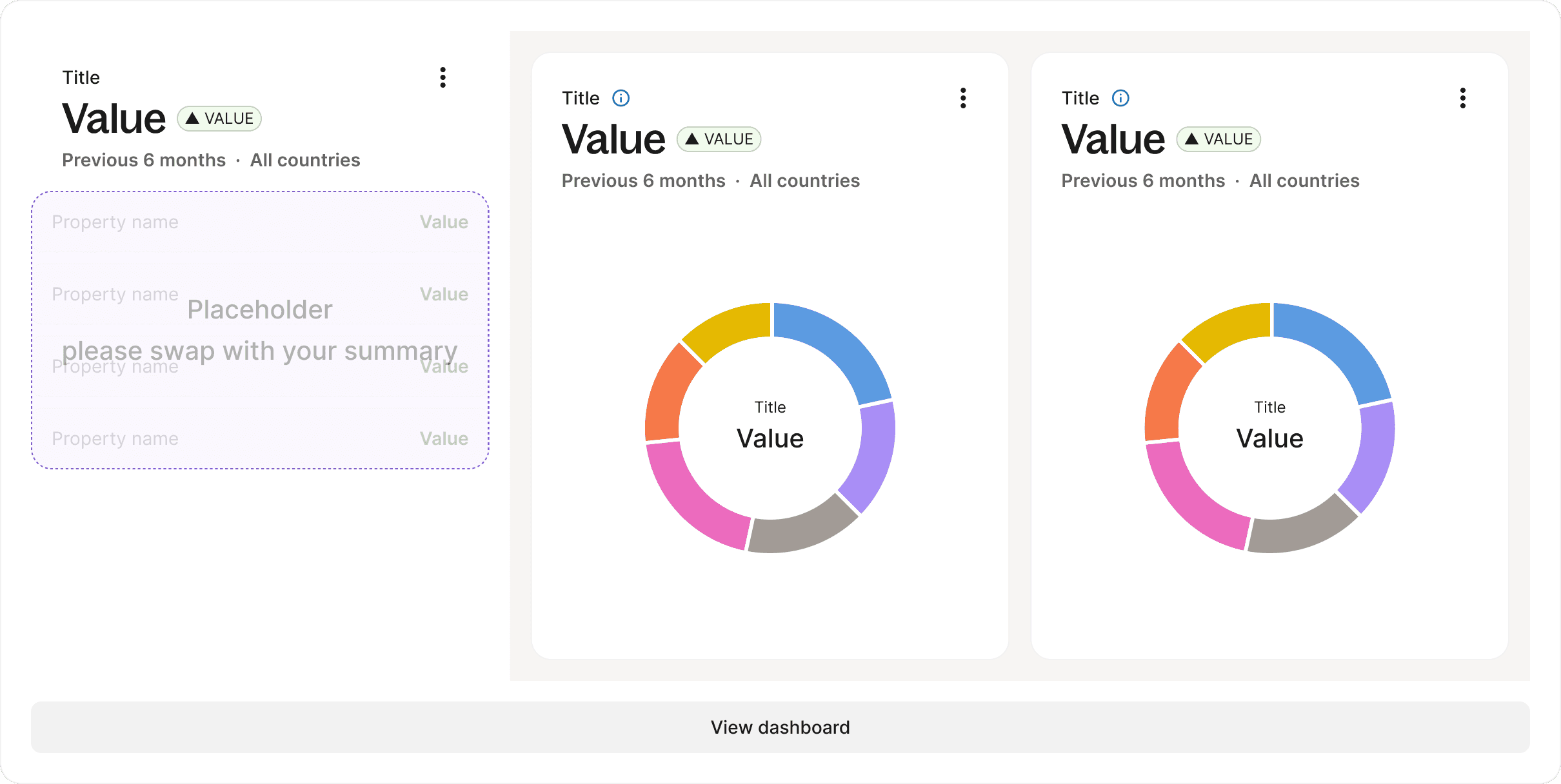
Component anatomy

By changing the background colour, outlines and text, all the variants are created. Along with the interactive states, this fulfils all the use cases of the product.
Icons are set as props in the component, they can be activated or hidden in the properties panels. There is a Start Icon (left) and an End Icon (right).


Large components are made up of foundations and smaller components. This helps to build the system faster and helps keep the system consistent.
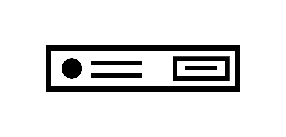
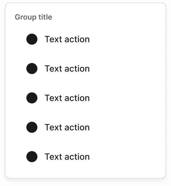
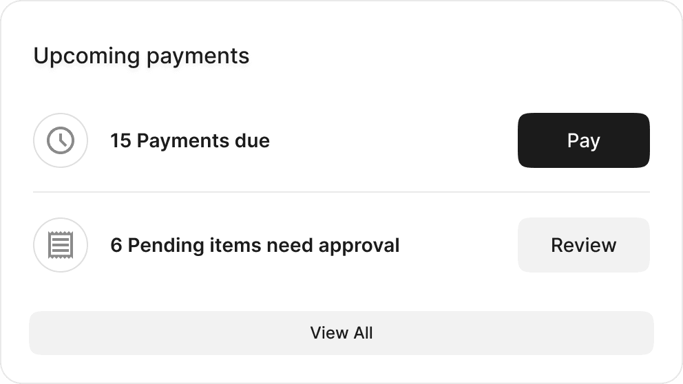
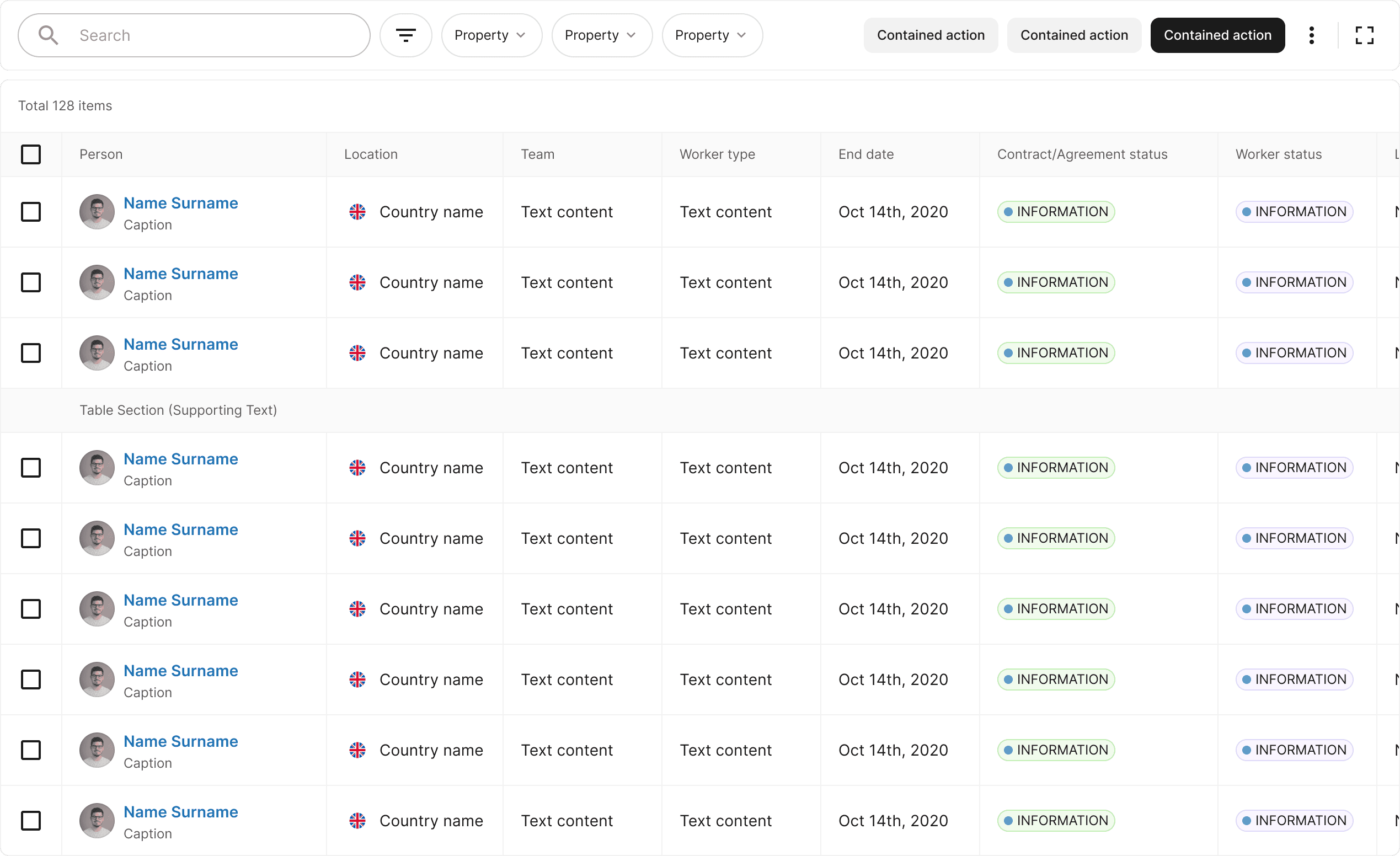
This is a variant of the Cell, the most commonly used component in the system. The Cell is used for showing integrated information and can offer high-level interactions like Edit and Delete. While the Cell provides a brief overview, it's common to link a detail page providing more detailed information.
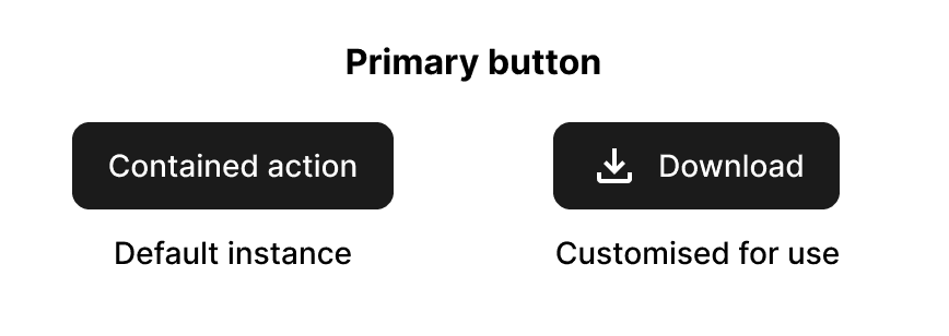
Contained action
Cell variants
As the Cell is the most used component in the product, there are a lot of different use cases for the Cell, so it required different variants in order to fulfil all of the demands of the product team. Other variants of the Cell:
Property name
left caption
Value
right caption
Label
Switch Item
caption
1
caption
new
Other medium components
Menu: opened with Dropdowns
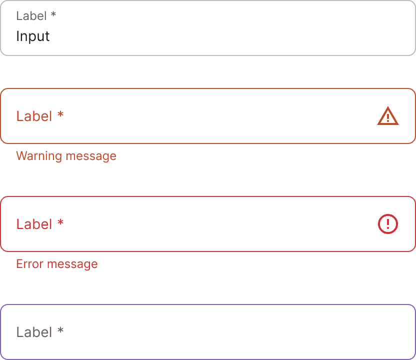
Text Field: default, warning, error, edit states
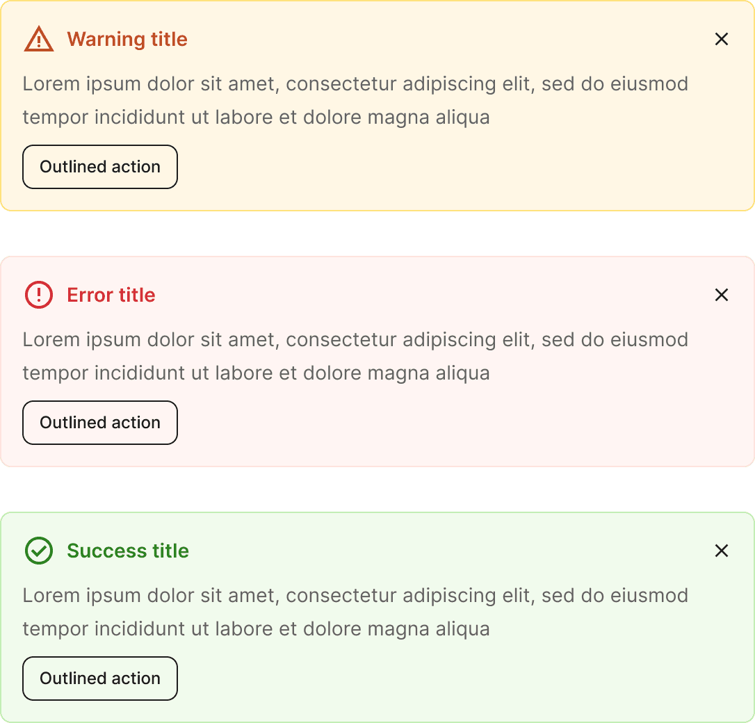
Alerts
Large components are made up of small and medium sized components and foundations.
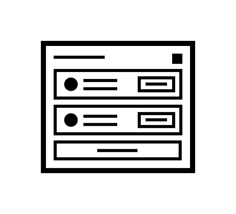
This is a Box component, a Box serves as a container for other components, with the option for a title and icons in the header and a button in the footer.
Here's an example of the Box based on a specific use case.
Other large components
Document Viewer
Chart
Data Grid

05. Templates
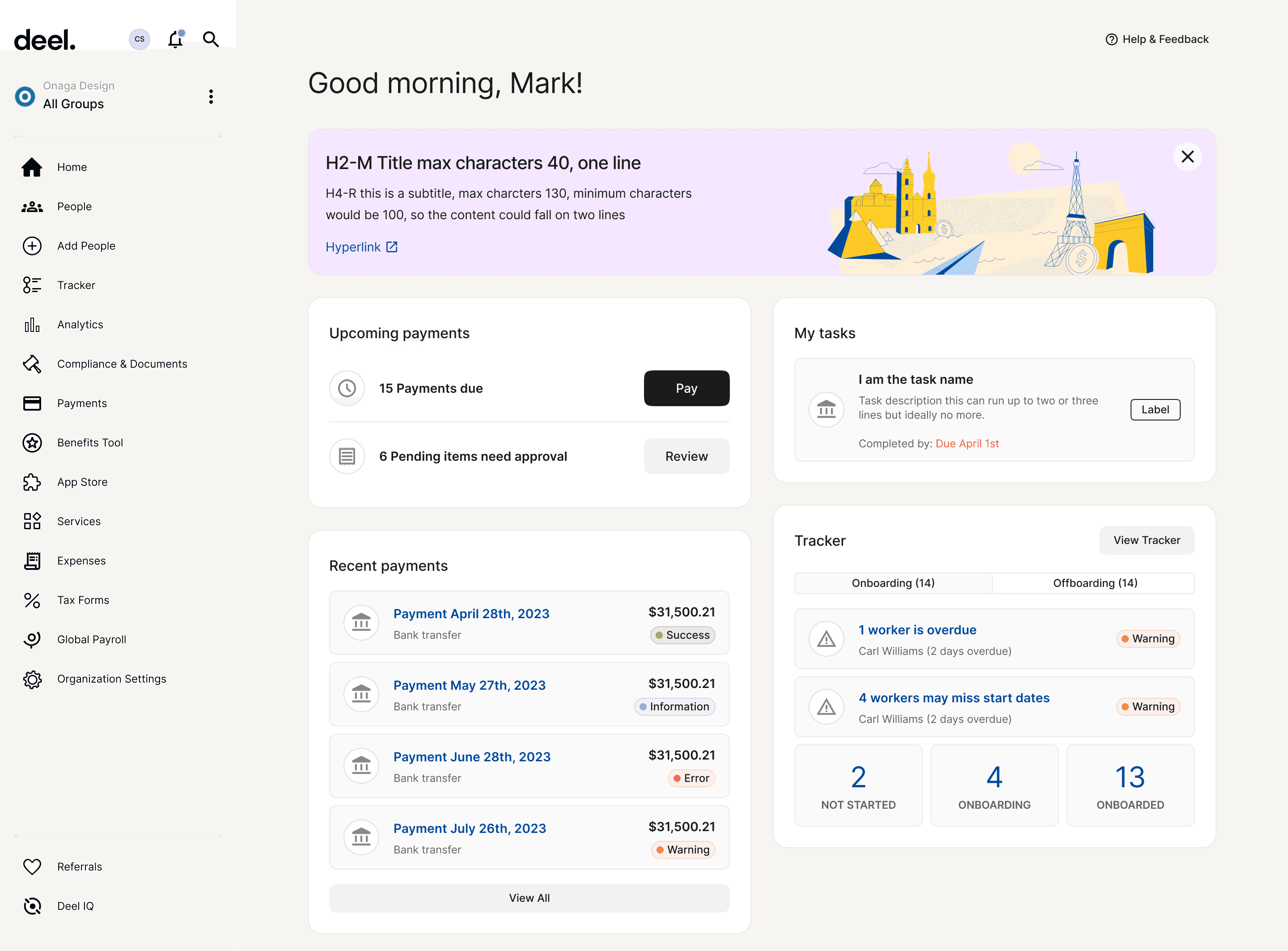
Homepage template
A template is where components and foundations come together to recreate a core page of the product. The homepage template is the most commonly used template by designers. There are other variants based on user accounts.
Templates were added to the system after it was built. From reviews we learned that adding reusable templates saved designers time, as they didn't have to build it each time, or copy it from an old project. It also meant that spacing and margins would be correct Something that was very common and led to inconsistencies in the product.

People template

Payment flow template

Org settings template
Conclusion
From the work the Product Org would build the app for efficiently, consistently and with less tech debt. The project was a success upon delivery and was adopted by the Org as standard procedure. The system had the added benefit of being used for the Admin dashboard, internal tools and other bootstrap style projects.
Build averages went down 40% from 8 hours to 5 hours when using the system. This led to estimated savings annually of:
1st year
$2.7 million
2nd year
$5.1 million
The numbers increased as the Org grew and we released new features.
Usability improved and we began working with more collaborators. It also made new features possible, like improved accessibility, rebranding and dark mode, which I'll document in other case studies.
Consistency increased by +30% where the system was adopted. This had a positive impact, unifying the user experience and creating less tech debt.
What next?
Although done we were aware of the areas we had marked for improvement, for Phase Two. Next steps included:
Scale the system
Measure and improve the performance of the system
House the Documentation and standardise how to write it
Parity (or alignment). Make the system the same for design and dev
Improve designer and developer experience - Using and contributing